Invenias - The No.1 executive search ATS
My role
I was leading the user experience across desktop, web and mobile – from the discovery research, user interviews, validation testing, designs and marketing materials. Responsibilities included upgrading the legacy product with improved user experiences and visuals, and creating 4 new products. A major design consideration was making sure the application styling felt like an extension of Microsoft for a seamless user experience.
Platform release date between Aug 2017 – Apr 2020
Highlights
- Increased revenue from £10M to £12M to £15.5M (55% increase)
- Reduced customer churn by 87%
- Designed for over 10,000 users
- Designed 5 products across web & mobile
- 1 Design system
The Challenge
The challenge was to build the leading executive search platform to drive productivity and results. The white-label SaaS applicant tracking system allows customers to engage with clients and candidates through portals, and run a business from multiple devices.
Customers needed to manage candidate, company and assignments (jobs) records around a REST API in order to publish candidate lists to their clients. To do this I needed to design these touch points:
1) Windows Desktop application (integrated into outlook)
2) Invenias Web application
3) iOS and Android applications (each native)
4) A Chrome extension (parse CV’s and LinkedIn profiles)
5) Client portal and candidate portal
I needed to design a system where all the products had an consistent user experience as users navigated across desktop, web and mobile in their workflows. Flexible workflows have greater adoption and delightful experience.
If you are unfamiliar with Invenias, watch the video I created. The video shows the Invenias application integrated into Microsoft Outlook. This was the MVP release which was iterated and improved on.
The solution
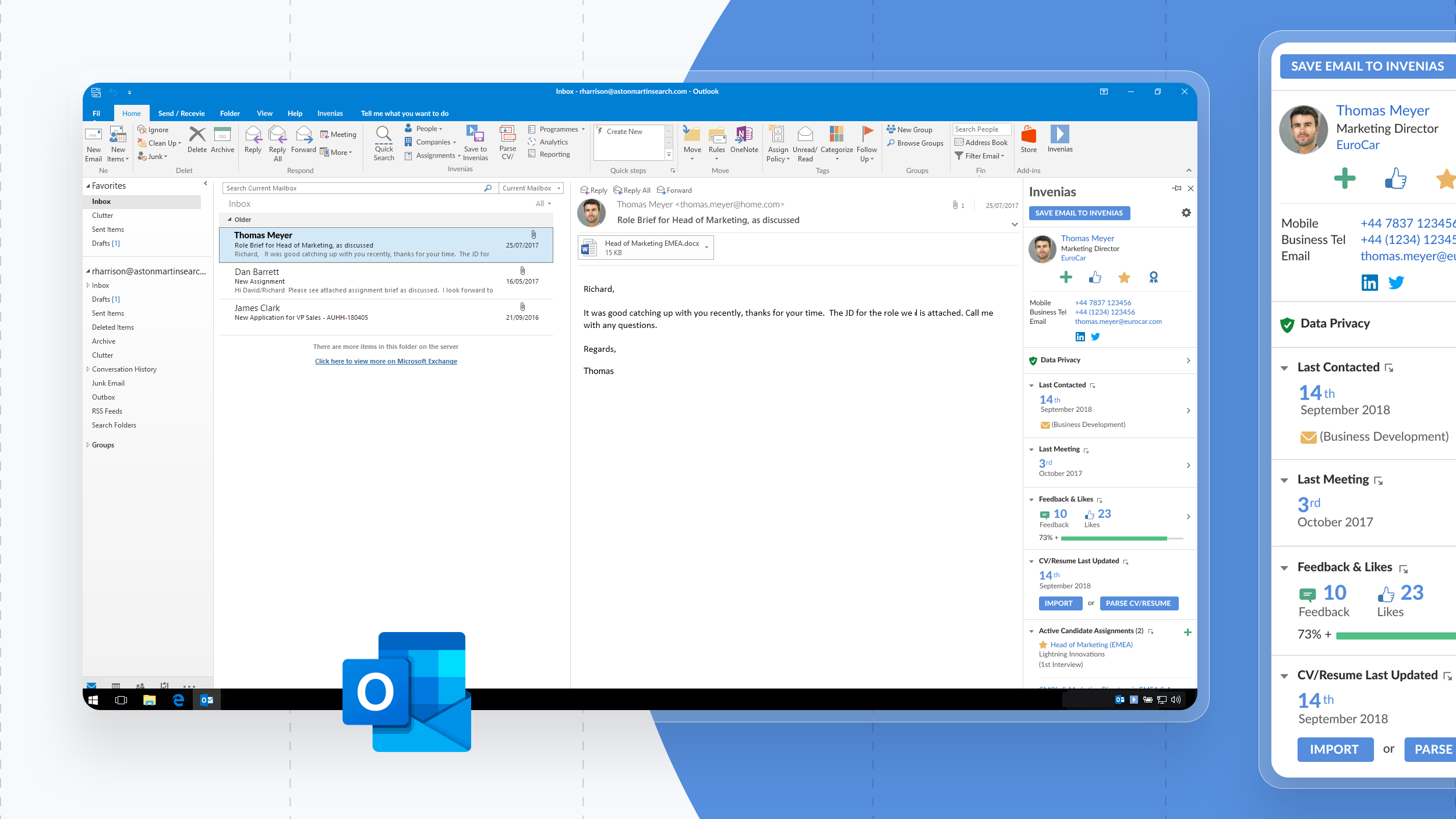
1) Microsoft outlook integration
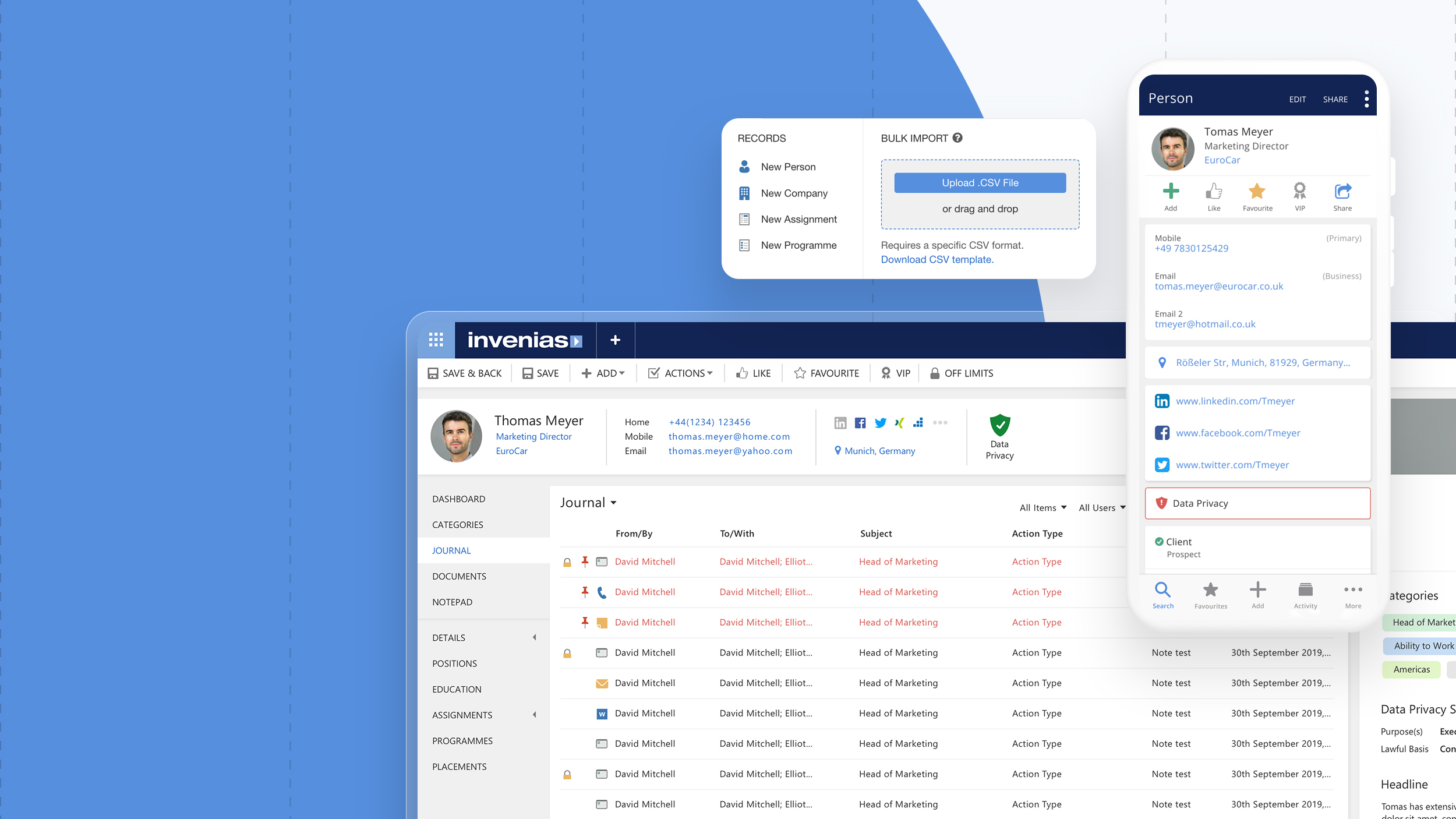
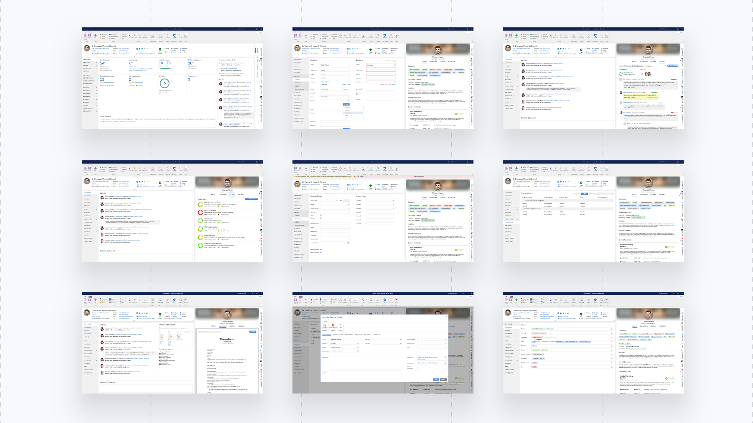
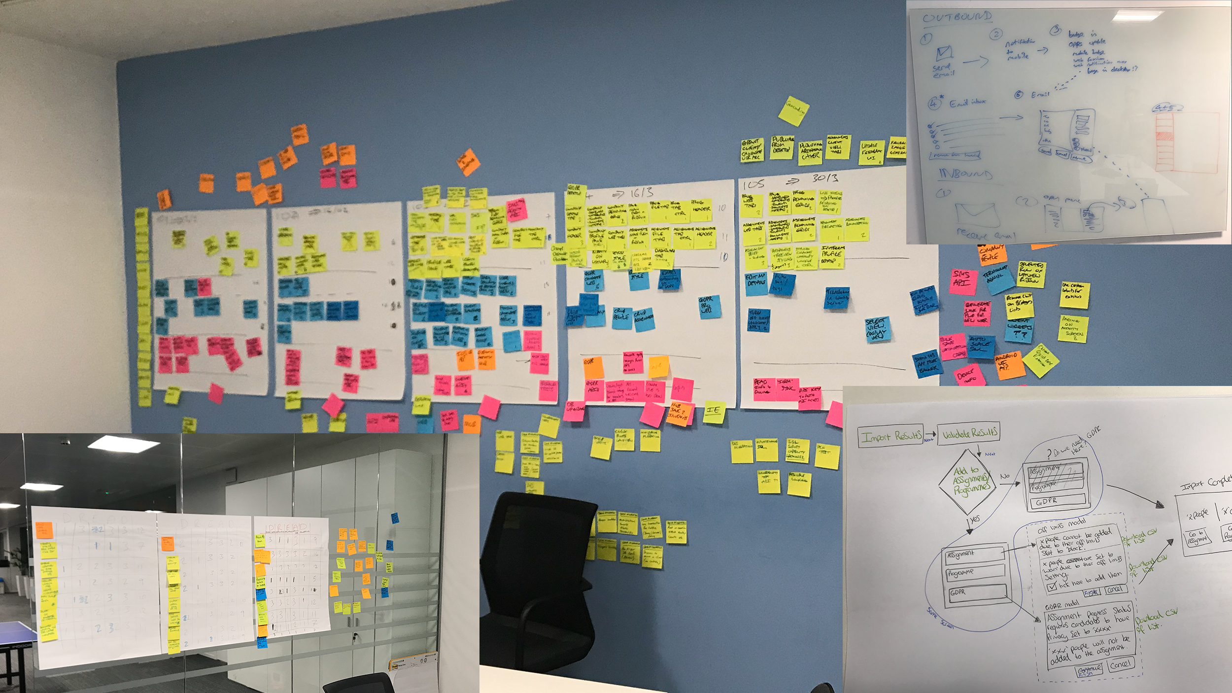
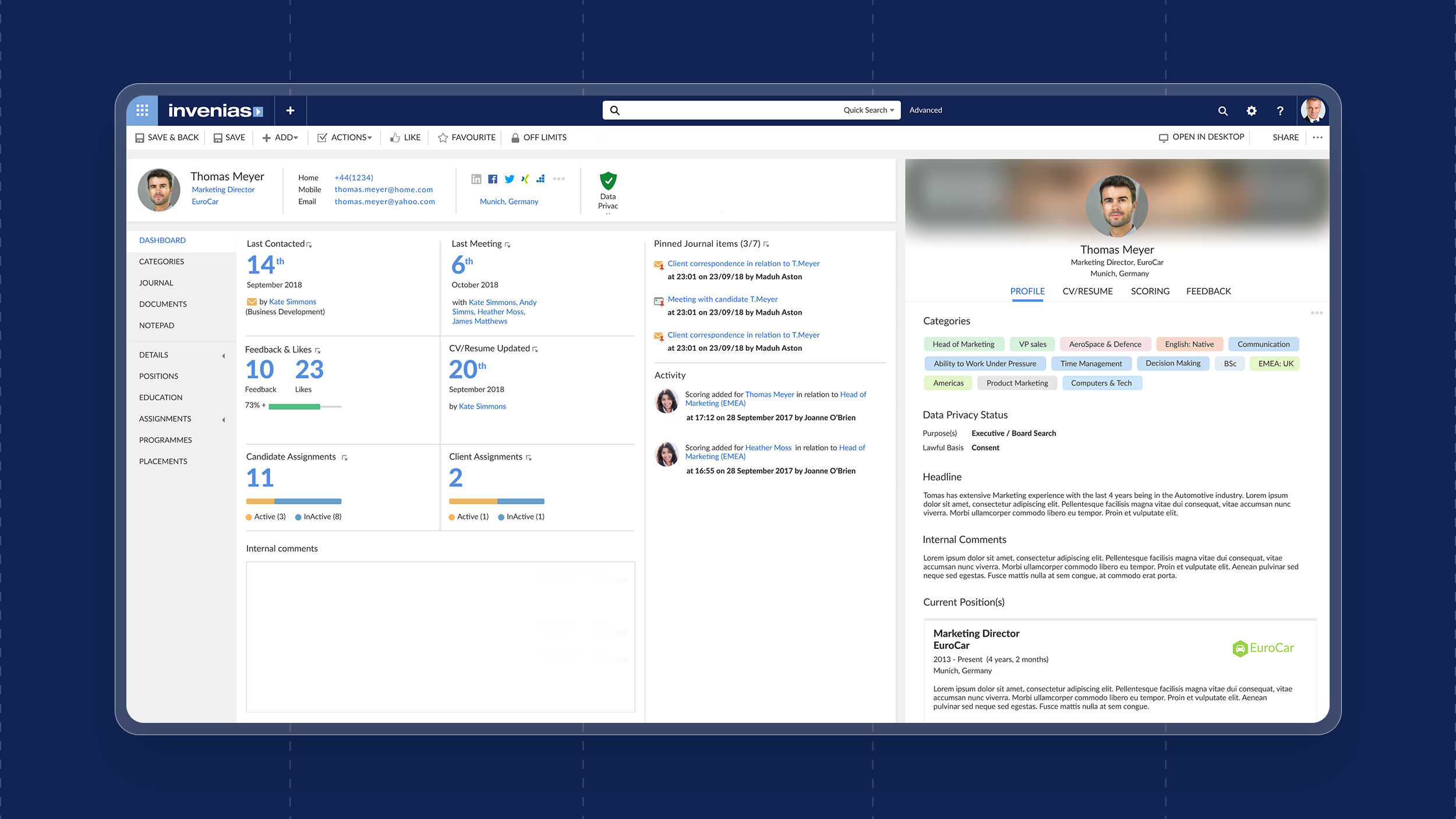
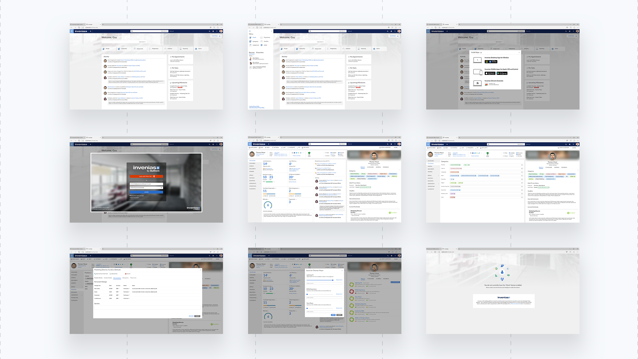
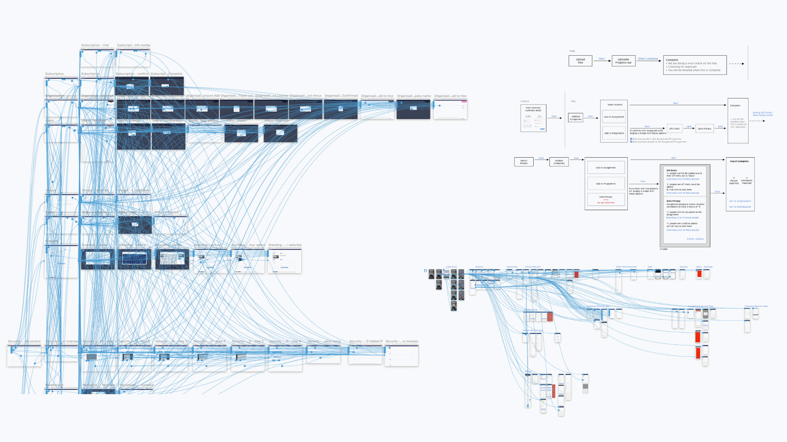
The desktop application integrated into Microsoft Outlook as this is where communications happen for clients and candidates. As the user cycles through emails, the info pane on the right-hand side updates with relevant information about the person. From there, users can create and update records, all without leaving Outlook. Also in the Outlook toolbar, there are quick menu actions to take you directly entities, speeding up the workflow. Each of 4 record entities (person, company, assignments and programs) had 320 prototyped screens – and that was just for the desktop application, not the web.
2) Web application
The web application is very similar to the desktop, including Office 365 integration. It was built for users on apple devices who did not run virtual machines to emulate a PC. The technologies between the two platforms were very different so one-for-one design translation was tricky, but possible. The user experience across the two platforms is 99% identical, allowing users to work at ease and with confidence.
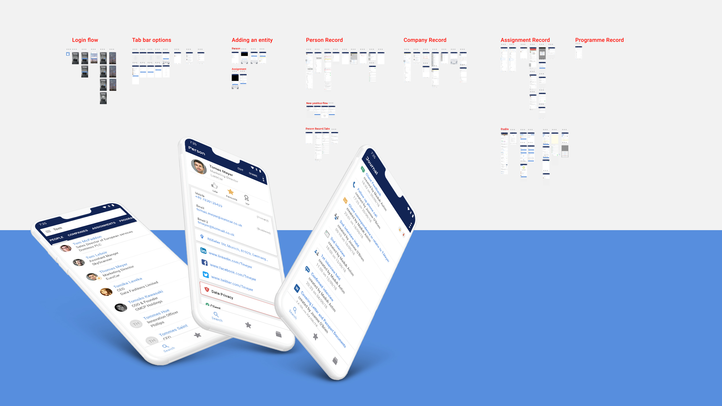
3) iOS & Android apps
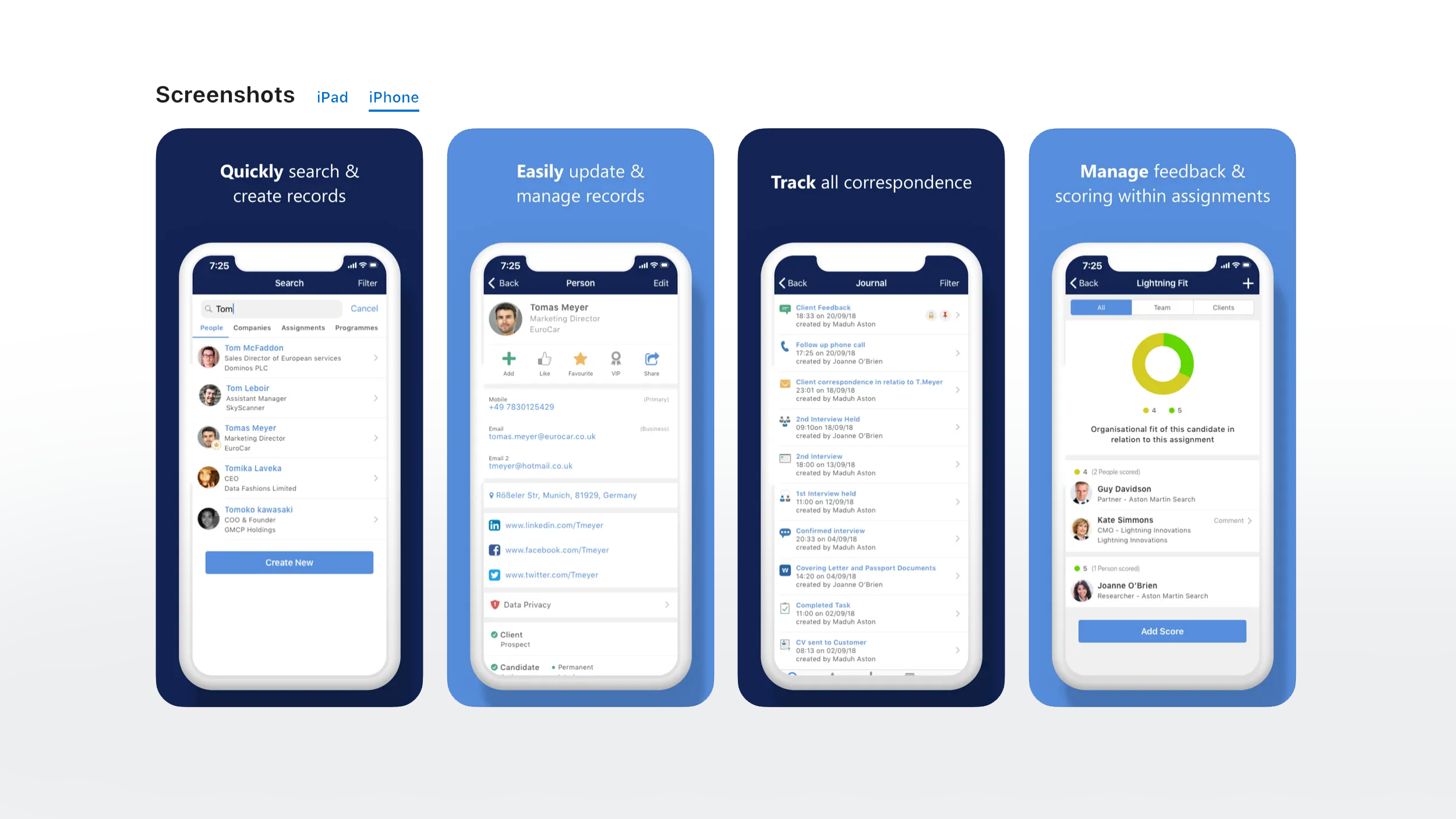
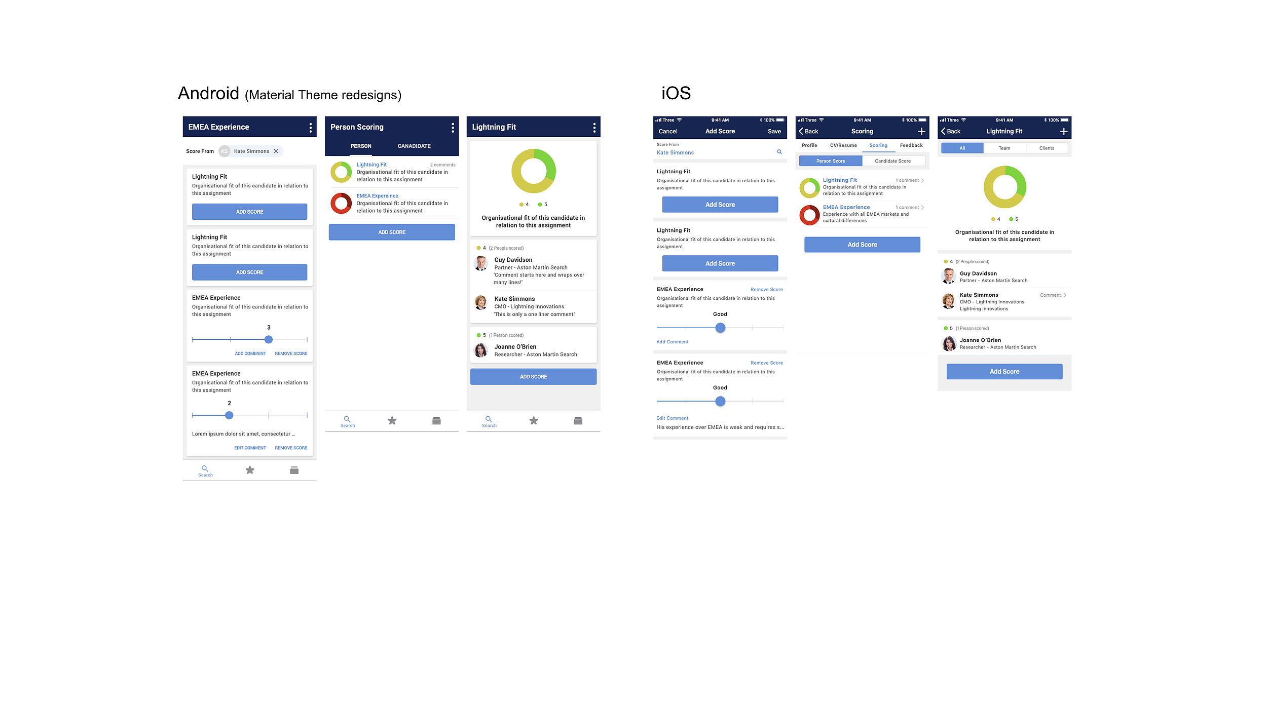
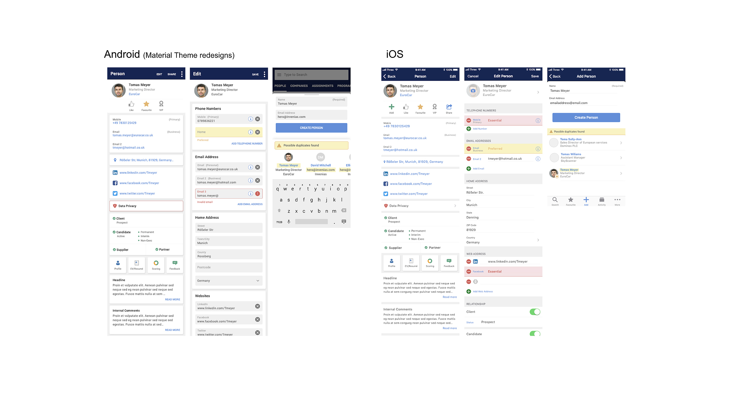
The Invenias X app is a complimentary offering to the ATS. It connected via the API and you could create any of the 4 record types, edit assignments, move candidates within assignments and add comments or scoring. The iOS app also worked on iPad without extra development.
The Android and iOS applications look almost identical, except page components (e.g save) have moved because of how each native applications works. This is giving the best familiar user experience per device.
4) Chrome extension
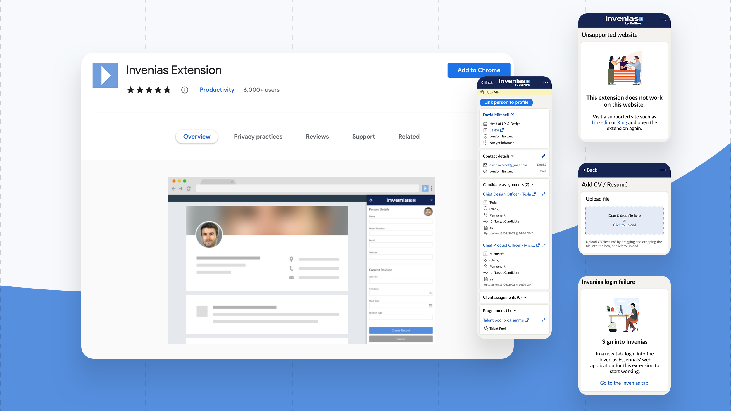
I designed the logic of the chrome extension which allows users to parse CV’s and LinkedIn profiles directly into the ATS. It worked in harmony with the invenias web application as users went back and forth in their workflow. When on a LinkedIn profile, the extension displays if a candidate exists in the database, or not. The extension takes out all the manual processing of writing detailed notes into the ATS with a one click solution. If updating or parsing an existing profile, it would present an update/duplication workflow so you only imported accurate data into the database. The worst thing about ATS/CRMs is the poor data management that clutters records with rubbish.
It’s against LinkedIn’s T&C’s to parse from their website, so to stay compliant, for demo’s I designed and built www.profileparsing.com that emulates a LinkedIn profile.
5) Client & Candidate portals
The client portal website is a white-labeled aggregation of candidate profiles where stakeholders can give feedback, rank and score profiles. To deliver the portal features faster, I used identical designs for both websites. The Candidate portal allows the user to track their progress in one of multiple assignments.
Images coming soon